fixing Navigation & increasing Revenue
The Sensitive Header Navigation
Michaels had a navigation problem that everyone could see, and making changes was a challenge. I took over this project a month after its kick-off and delivered measurable impact.
Business Problem
The browse navigation caused friction, and high-value services were scattered. Needed more category engagement without disrupting existing revenue
My Role
Led design process end-to-end, helped scale out design systems, managed expectations from stakeholders and users, and worked with PMs and engineers to bring designs to life.
The Constraint
Business and Marketing had to approve every step No drastic UI changesHad to use existing components
What I Contributed:
Identified goals and pain points
Held a workshop for stakeholders to understand goals and pain points.
Validated Assumptions
Utilized Baymard UX Audit to validate potential solutions proposed by the Business Team.
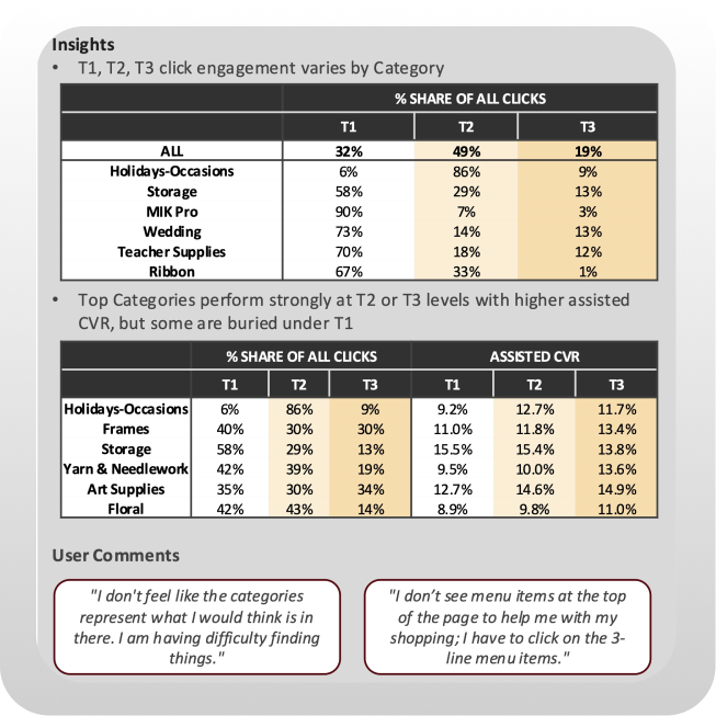
Leveraged Data Points and Heat Maps.
Collected heat maps to understand the customer touch points.
Conducted User Interviews
User tested current users to see how they felt about the navigation. Used AI to synthesize information.
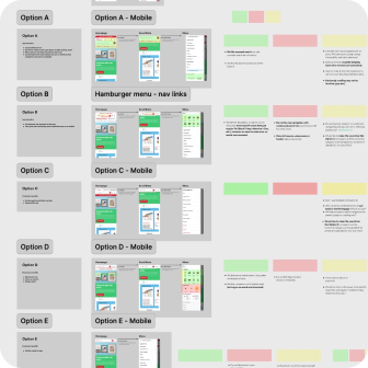
Rapid Iterations
Created 100s of designs alongside leadership to make sure our solution was effective
Communication
with Engineers
with Engineers
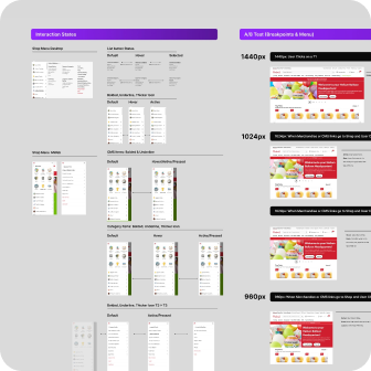
Documented flows and prototypes to communicate designs to developers.
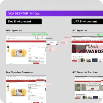
Visual Quality Assurance
Provided corrections to the staging environment.
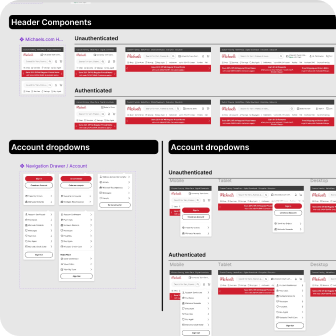
Scaled Design Systems
Scaled components to relevant devices using our variable library.
Getting Familiar with the Problems
Confusing Navigation
Customers don’t know if they’re headed down the right category group.
Too Much Clicking
Took up to 5 clicks to get into specific categories. Customers dropped halfway through.
Lack of Visibility
Customers could not find services such as “Buy Again”, Events, to the top of the page

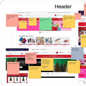
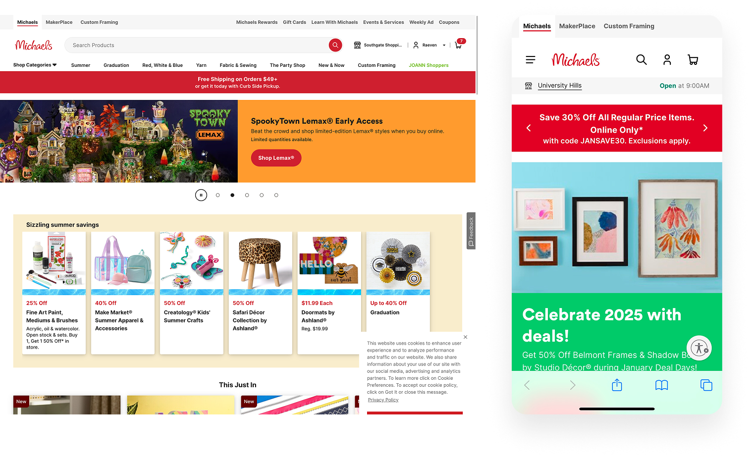
Header
Desktop
Customers don’t know where to look. Links are sprinkled without intent on desktop.
Mobile
Most of our menu is hidden. There is no clear hierarchy; customers have to guess where to go.
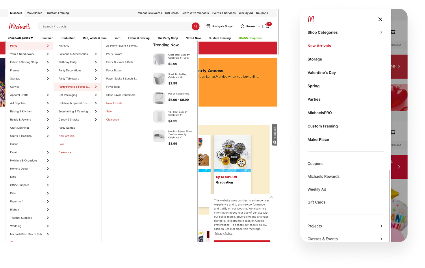
Menu
Desktop
Too many clicks, high bounce rates.
Mobile
Not easy to scan. Leaves customers going in and out of drawers.
RESEARCH
User Testing and Interviews
We gathered and synthesized information from internal workshops & user interviews, using Marvin AI to create our own repository, where we could leverage it to ask our AI questions about our customers.
Stakeholder and Customer Insights
Research
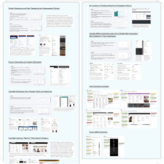
Competitive Analysis
We looked at how other e-commerce sites organized their navigation, looked at their hierarchy, and wanted to find out what worked well.
Looked for Opportunities & Found What Would Work For Us
We audited other companies to see what was working for them.
Prioritize CMS Links
Add a section on the navigation that business and marketing can control.
Simplify Navigation
Reduce the number of clicks needed to find products, services. and important links.
Visual Language
Added imagery for faster scanning.
Led Ideation with the constraint of, "No drastic changes"
I worked with the overseas teams to generate multiple layouts that highlighted key features while keeping the header as unchanged as possible. We needed to justify every option and decision to our stakeholders.

Final Designs
Landed on final designs that didn't change the look too much while upgrading the UI and the options the header offered.
Improved Hierarchy
Improved hierarchy with most popular features and categories.
Positive Feedback
Positive feedback from current customers who discover new categories.
Better Visibility
Consolidating service offerings in one place increased page visits.
Mobile

Before

After
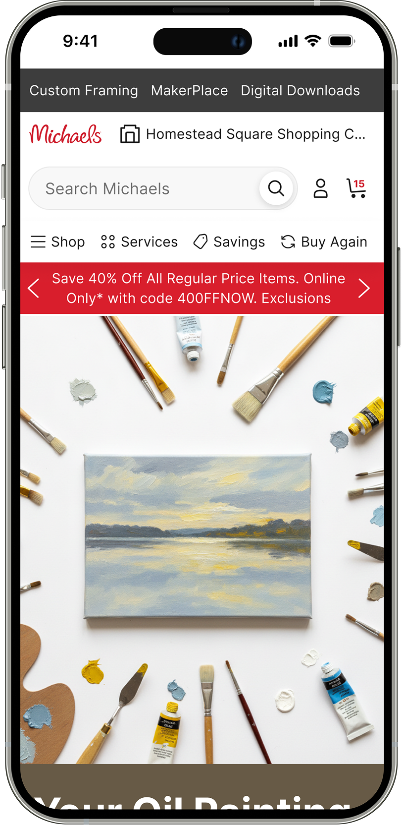
Header Changes
- Navigation is intentional
- Search field exposed
- Useful links prioritized
New Shop Menu
Raised popular categories to the top of the menu
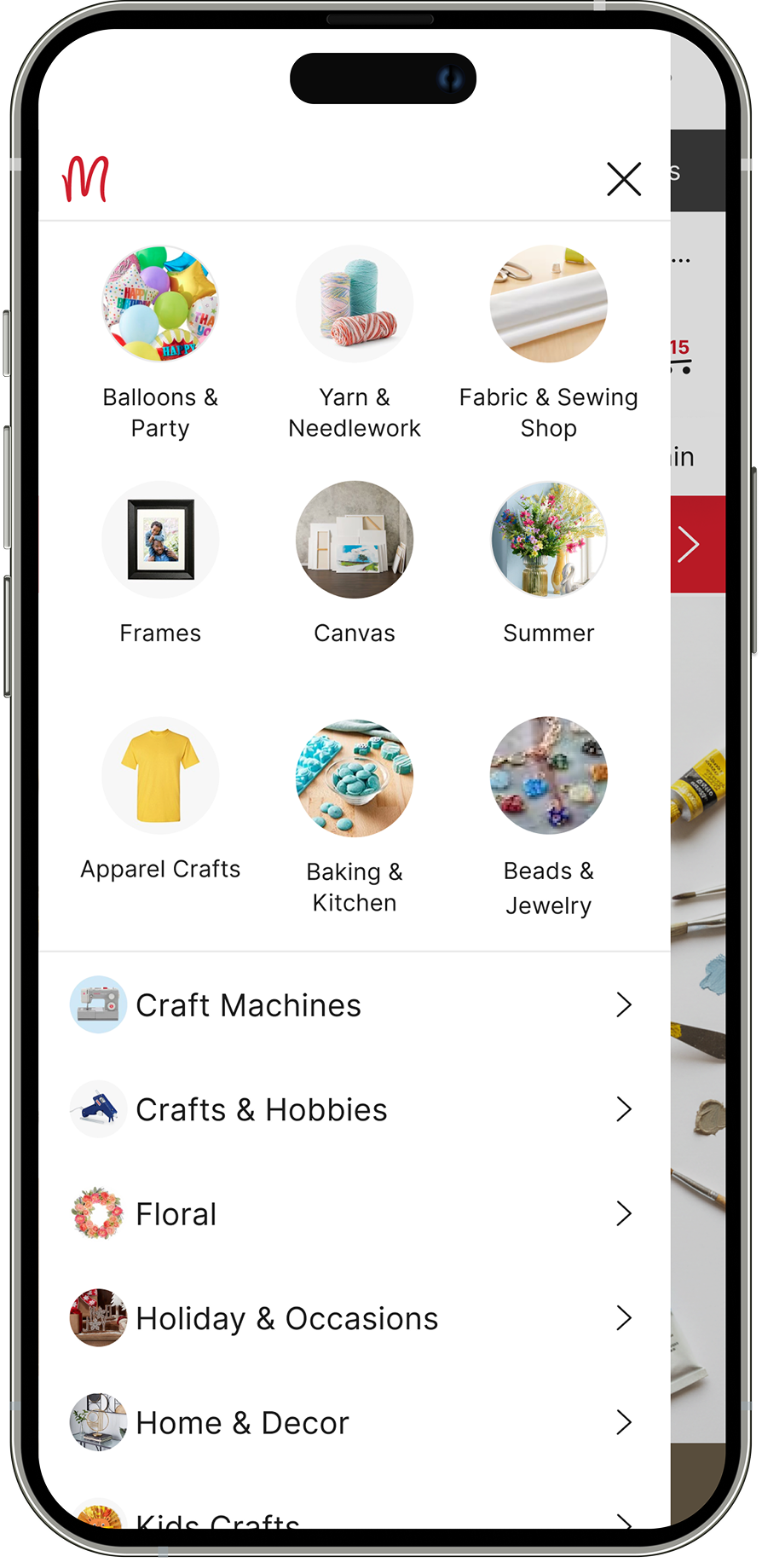
Service Menu
Consolidated all services into one drawer on the menu.

Desktop

Before
Categories were hidden
Headers were cluttered
Useful pages were not prioritized

After
Visually cleaner
Services are consolidated
Useful links are accessible

New Shop Menu
Most options can now be found within 2 clicks.

Service Menu
Consolidated all services into one drawer on the menu.

Feedback from Customers
Incremental change, significant results.
If I could go back, I would lean more into breaking the mold and trying something new outside our design system.
The limiting factors were the outdated branding and design systems. Stakeholders feared that making too many changes would result in a loss of revenue. If I had the opportunity, I would expand our search menu to include more popular categories, create scalable responsive components, and declutter the current experiences.


